
When people are moving house, changing seasons, doing a year-end clear-out, or simply needing space, they often want to dispose of secondhand items. However, “where to sell” is not solved by one marketplace. Different categories and conditions have different best routes: buyout, consignment, C2C selling, or donation/recycling. The rules, fees, and contact methods are scattered and unclear, so users spend time on trial and error.
Problem Overview
The product: This is a decision-support app for selling second-hand items. It acts as a routing assistant, recommending the most suitable selling channel (buyout, consignment, C2C marketplaces, or donation) so users can clear items faster with less trial and error.
The problems: People want to clear second-hand items that are still in good condition, but they do not know where to start. It is hard to find a low-effort and trustworthy way to choose the right route or shop that can handle the item within a deadline and still give an acceptable result.
The goals: Help users get started quickly and find the right buyer or selling route (buyout, consignment, C2C marketplace, or donation) to clear items on time with minimal effort.
My role: UX/UI Designer (End-to-end, individual project)
I led the design from problem framing to wireframes and high-fidelity prototypes.
Responsibilities: I defined the product direction and MVP scope, including a route-first flow with progressive disclosure and clear comparison fields. I conducted user research, turned insights into the information architecture and user flows (with a simple goal switch), and built low-fidelity wireframes plus an interactive Figma prototype. I designed explainable route cards (payout, speed, effort, distance/time, and eligibility) and iterated the design based on usability feedback and key edge cases.
User research
I conducted an survey with 10 respondents (all women) to understand why people dispose of rarely-used items, which categories they struggle with most, and what prevents them from taking action. The results indicate that disposal is primarily triggered by the need to reclaim space (e.g., limited space and year-end decluttering), with clothing/outerwear and home items/small appliances emerging as the most common categories to address.
Respondents showed strong interest in a “routing assistant” concept that recommends the most suitable route (sell / consignment / donate) and highlights key comparison information. The most influential factors for prompting action were credibility signals (e.g., reviews, physical shop presence, receipts) and a clear estimate of expected proceeds. Process friction was concentrated in listing creation, packing/shipping or arranging meet-ups, and the broader time/effort burden of end-to-end selling: suggesting clear opportunities for a safer, more reliable, and lower-effort disposal flow.
The most frequently cited item categories


Clothing
60%
Books
40%
Gadgets
30%
Obstacles participants face when selling second-hand items


Listing and writing descriptions
40%
Packing/shipping/arranging meet-ups
40%
Handling enquiries/negotiation 30%
Information and features that build trust and drive action


Trust indicators (e.g., reviews/ratings, physical storefront, receipts, etc.)
80%
Estimated price range
60%
Item eligibility
40%
Pain points


High effort to get started
Preparation & fulfilment overhead
Not selling, or taking a long time to sell.


Low trust and uncertainty
Social friction
Persona: Ya-Ting

Just make it easy, I’ll pay for the convenience.
Ya-Ling is a busy professional who struggles with organising and administrative tasks and is willing to pay for a service that saves her time. She needs trustworthy, transparent buyback recommendations because she wants to confirm the shop’s credibility, item eligibility, and an estimated payout before taking action.
Ya-Ting Chen
Age: 42
Education: Master’s degree
Location: Taipei City
Family: Single
Occupation: Marketing Operations Manager
Goals:
Find a trustworthy shop that can buy her unused items and take care of everything.
Frustrations:
Too many scattered sources; no time to reach out to multiple shops to confirm eligibility and prices.
Lifestyle: Busy weekdays and limited storage at home; not naturally good at tidying, so she’s happy to pay for services that reduce effort and decision-making, and prefers predictable, one-and-done errands over back-and-forth messaging.
User Journey
| Stage | User goal | Key actions | Pain points | Opportunities / UX implications |
|---|---|---|---|---|
| 1. Trigger & motivation | Clear space quickly with minimal hassle | Notices clutter; decides to declutter (year-end/seasonal change/space limits) | Overwhelm; procrastination | Offer a “quick start” flow and estimated effort/time per route |
| 2. Decide whether it’s worth acting | Avoid wasted time and disappointment | Mentally weighs value vs. effort; considers selling vs. donating | Uncertainty about resale value; fear it won’t sell | Provide a fast “worth it?” assessment and expected proceeds range |
| 3. Explore routes | Choose a route that feels safe and reliable | Browses platforms/shops; compares options | Too many fragmented sources; unclear eligibility/requirements | Route recommendation based on item type, condition, and deadline |
| 4. Build trust & confirm eligibility | Feel confident before committing | Checks reviews, shop legitimacy, requirements, and constraints | Low trust; unclear rules; hidden costs | Emphasise credibility signals; transparent eligibility and terms |
| 5. Prepare item(s) | Get ready with minimal effort | Gathers accessories/receipts/packaging; takes photos | Preparation is tedious; not sure what’s needed | Auto-generated prep checklist; photo guidelines; “what to bring” list |
| 6. Execute the route | Complete disposal with minimal interaction | Lists item(s) or books a buyback/consignment/donation | Listing writing is burdensome; messaging/negotiation is draining | Template-based listings; assisted replies; optional “done-for-you” service |
| 7. Handover & completion | Finish smoothly and avoid issues | Ships/meet-ups; shop drop-off; donation handover | Logistics coordination; cancellations; returns | Clear handover instructions; appointment booking; status updates |
| 8. Outcome & reflection | Feel satisfied and reduce future friction | Receives money / confirmation; closes task | If outcome feels “unfair” (too low) users regret | Set expectations upfront; offer alternative routes (e.g., donate if buyback is too low) |
Design decisions / Iterations
The results page required careful information prioritisation, so I separated ‘must-have’ details from ‘nice-to-have’ content to keep the UI scannable.
This helped prevent cognitive overload and reduced drop-off during decision-making.
Starting the Design
Colours Research
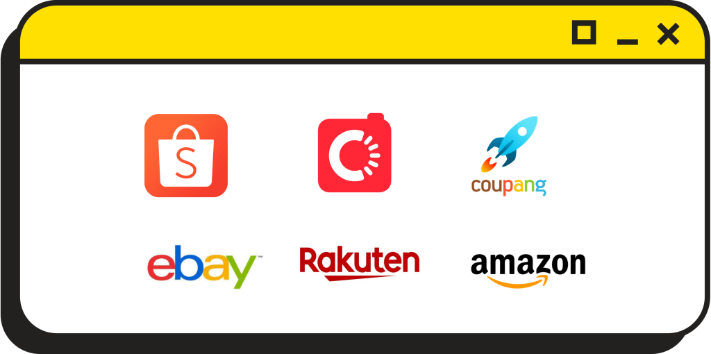
I collected logos from major East Asian e-commerce platforms (left) to identify category colour signals. Orange and red are repeatedly used as dominant colours, suggesting strong category associations such as visibility, urgency, and promotional cues.
However, this product is not intended to be “another selling app.”
Instead, it helps users find the right way to deal with their second-hand items. Therefore, I chose a colour palette that communicates professionalism, reliability, and a sense of technology.

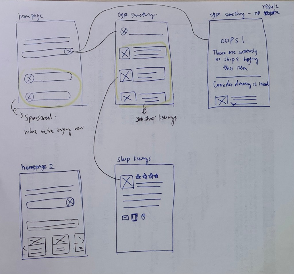
Paper wireframe
High-fidelity prototype
The successful shop-matching journey
After analysing the questionnaire results, I did desk research and explored ideas with AI. In this case study, I focused on solving the top pain points and addressing what participants cared about most.
For the ‘matched shop found’ flow, I made these key design decisions:
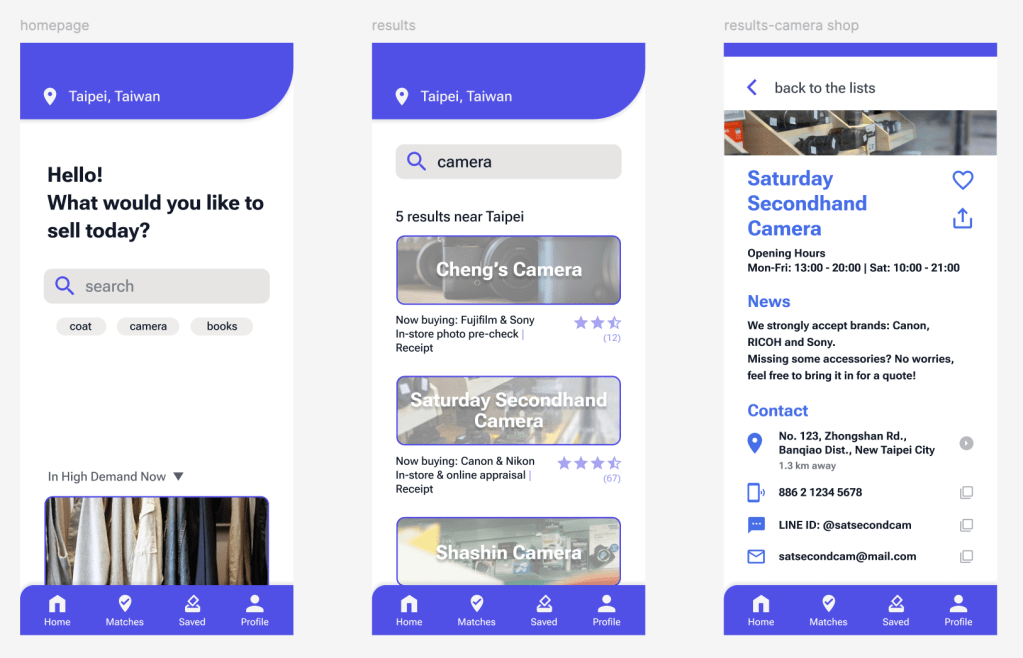
- Add location context and highlight nearby shops.
I show which shops are close to the user, and include a short ‘Now buying’ information to clarify eligibility and improve trust. This helps users who feel it takes too much effort to get started (for example, browsing multiple channels or contacting shops one by one). - Provide more detail on the selected shop page.
Once a user taps a shop, they can see clearer buying requirements and contact information, so they can take the next step with confidence.
I also adjusted the homepage to keep the experience focused:
- Reduced the sponsored area so users’ attention stays on the main task (searching).
- Added “Recent results” so users can continue where they left off.
- Added location to make recommendations feel more relevant and actionable.
The ’no suitable shop found‘ journey
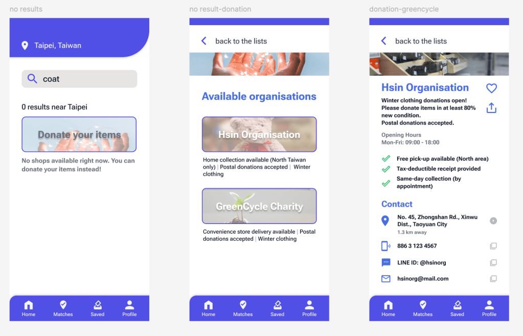
If no matching shop is found, the experience falls back to a dedicated Donation page. Based on the survey, donating was the most common current behaviour (50%), so I treated donation as a primary alternative rather than an edge case. The Donation page follows the same layout structure as the shop detail page, and provides clear, practical information (such as accepted items, condition requirements, and delivery options) to help users take action quickly.
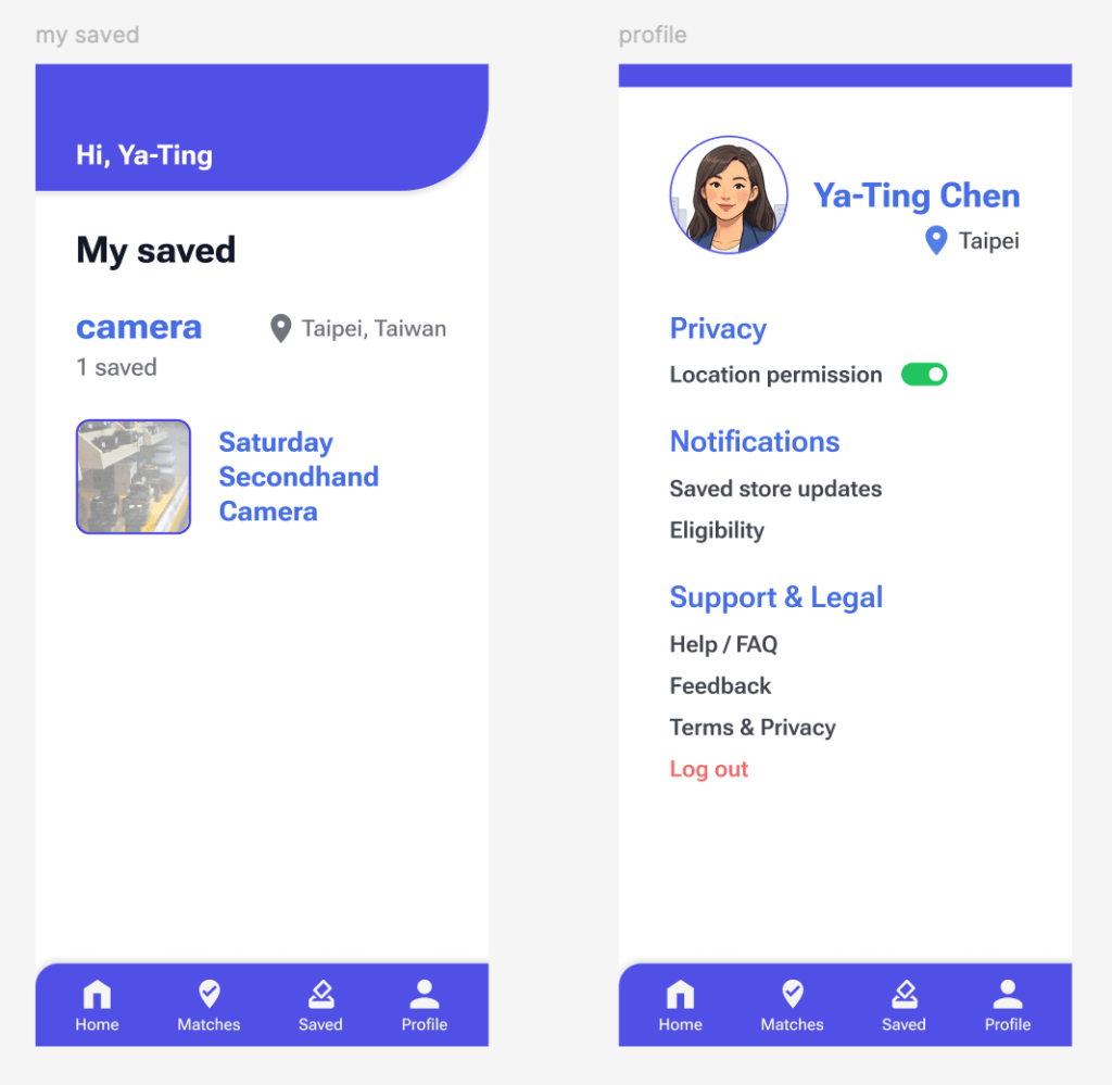
Lastly, I added a Saved page so users can bookmark shops they may want to use again, or keep for future reference. This supports repeat decisions: next time they need to sell items, they could start from these saved options instead of searching from scratch.
I also included a Profile page for key settings and support, such as location access (on/off), notification preferences (for saved shop updates), FAQs, and other basic account options.
Going forward
Takeaways
- Trust matters more than ‘max price’. The survey suggests most users are willing to wait longer and accept a lower payout, as long as the shop feels reliable and the process is predictable.
- Reducing uncertainty is the core value. Users hesitate mainly because it feels time-consuming and unclear where to start. Clear eligibility and practical shop details help them act faster.
- A low-effort start is essential. Keeping the homepage minimal (search-first, with location and recent results) supports quick decision-making without overwhelming users.
- Donation is not just a fallback. Since donating is a common behaviour, a Donation page makes the “no match found” flow feel helpful rather than like a dead end.
- Information density needs structure. Using short features information on the results list and moving details into the shop page keeps the UI readable while still supporting informed decisions.
Next Steps
- Standardise shop data fields (eligibility, requirements, appraisal method, payout rules, contact links).
- Define rules for ‘Now buying’ updates to reduce outdated eligibility information.
- Expand and standardise donation listings (accepted items, condition, delivery methods).
- Track key metrics (detail views, contact/nav clicks, save rate, donation conversion).
- Pilot one category first (e.g., cameras & electronics) before scaling to more categories.
Thanks for your visiting.
Hoping you enjoy this journey!
