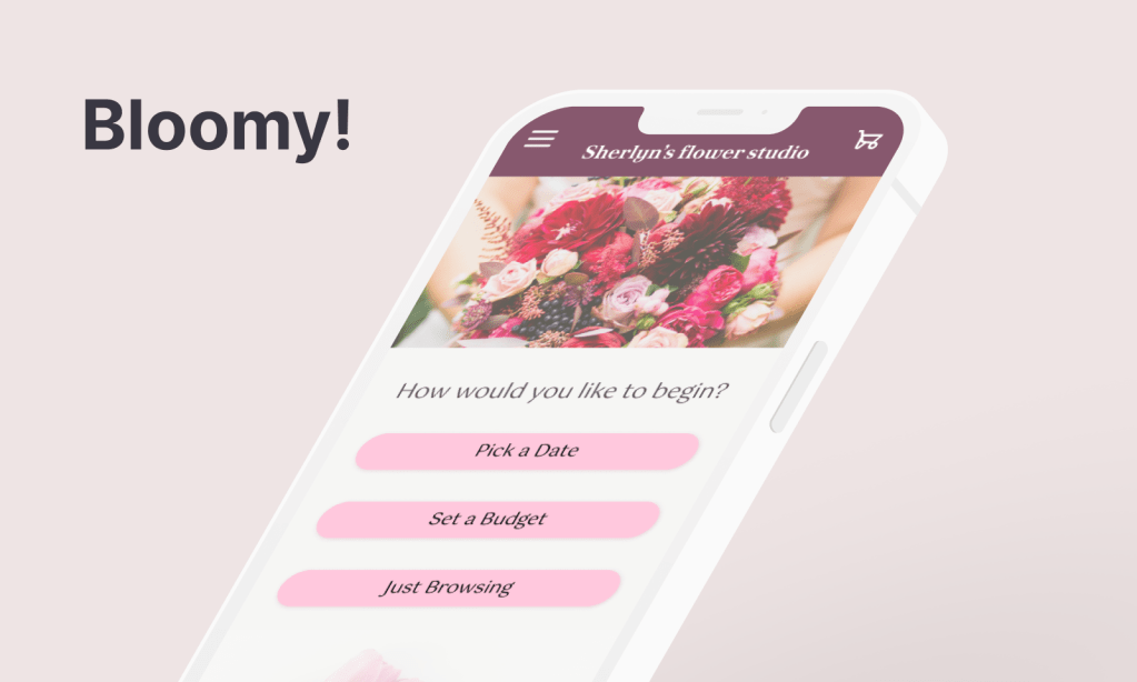
Bloomy! is a mobile app concept that helps users quickly find bouquet options that match their budget and schedule.
This’s an UX case study inspired from my real observations and my own experience buying flowers.
Bloomy! 是一款協助忙碌的現代人快速找到符合預算與時間的花束訂購 App 概念設計。靈感來自真實購花經驗:消費者不知道當季合理價格、或臨時需要花束卻不清楚哪間花店有空檔;而花店則常面對不如預期的預算的客人與大量來回溝通的成本。
目標:讓使用者用最少步驟找到合適花店,同時減少花店與客人之間的資訊落差與溝通成本。
工具:Figma|時程:約 4 週|職責:獨立 UX/UI 設計師,負責端到端設計流程
涵蓋內容:使用者訪談・問題定義・資訊架構・低保真至高保真原型・可用性測試・設計迭代
Project Overview
Problems
From the client side: Customers lack knowledge about pricing, timing, and florist availability.
From the florist side: Shops struggle with unrealistic budgets, costly back-and-forth communication and holiday capacity.
Goals
Quickly match customers with realistic bouquet options while reducing miscommunication and cancellations.
My Role
Solo designer responsible for end-to-end design.
Responsibilities
Defined the problem space and project scope
Conducted preliminary research and user interviews
Developed user flows and information architecture
Designed wireframes and final UI in Figma
User Research
Usability study: Parameters
- Study type: Unmoderated usability study
- Location: Taiwan, remote
- Participants: 4
- Length: 10 minutes
Summary
Interviews and a survey showed that infrequent and first-time buyers were overwhelmed by too many early choices. Instead of deep customisation upfront, they preferred a guided, low-effort starting point.
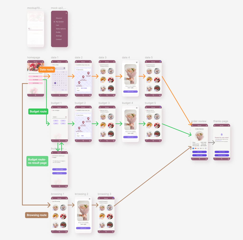
I therefore simplified the entry experience into three intents: ‘delivery date’, ‘budget’, or ‘browse’, to reduce decision friction and help users progress faster.
Paint points


Most clients have no idea what a reasonable price for a bouquet is.
They don’t know
which nearby shops are available.
They are not sure how early they should reserve, especially before holidays.
Persona
Problem statement:
Quinn is a busy professional who needs a way to quickly find and order the right bouquet because she doesn’t have time to compare local florists or check if pickup times fit her schedule.
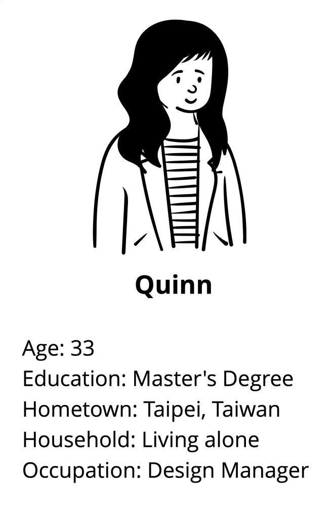
Goals:
To find a reasonable priced bouquet from a nearby florist and ensure it’s ready for pickup on time without taking time away from her already packed schedule.
Frustrations:
- No time to search through multiple florists, compare prices, and check their availability.
- Unsure which nearby florists offer pick-up options and can meet their needs.
- Worried the final product won’t match their expectations or budget.
User Journey Map
Persona: Quinn, a busy professional with limited time. Prefers in-store collection to avoid waiting for delivery.
Goals: Find a nearby florist that fits her budget and schedule, and confirm a collection time before her partner’s birthday.
| Action | Browse Shops | Choose Bouquet | Pick a Date | Select Time Slot | Confirm & Pay |
| Task list | Opens app, filters by budget, checks shop page | Reviews price, size and style | Taps “Select Collection Time” | Picks a slot that fits schedule | Reviews order and pays |
| Feeling | Wants quick, suitable options | Hopes to decide quickly | Wants immediate clarity | Needs certainty it’ll be ready | Wants a smooth finish |
| Opportunities | Highlight “Earliest Collection Time” and “Click & Collect” | Clearer product info and preparation time | Show available/unavailable slots upfront | Display estimated preparation time and recommended slots | Provide a concise, reassuring summary |
Digital Wireframes
1. First Low-fidelity Prototype
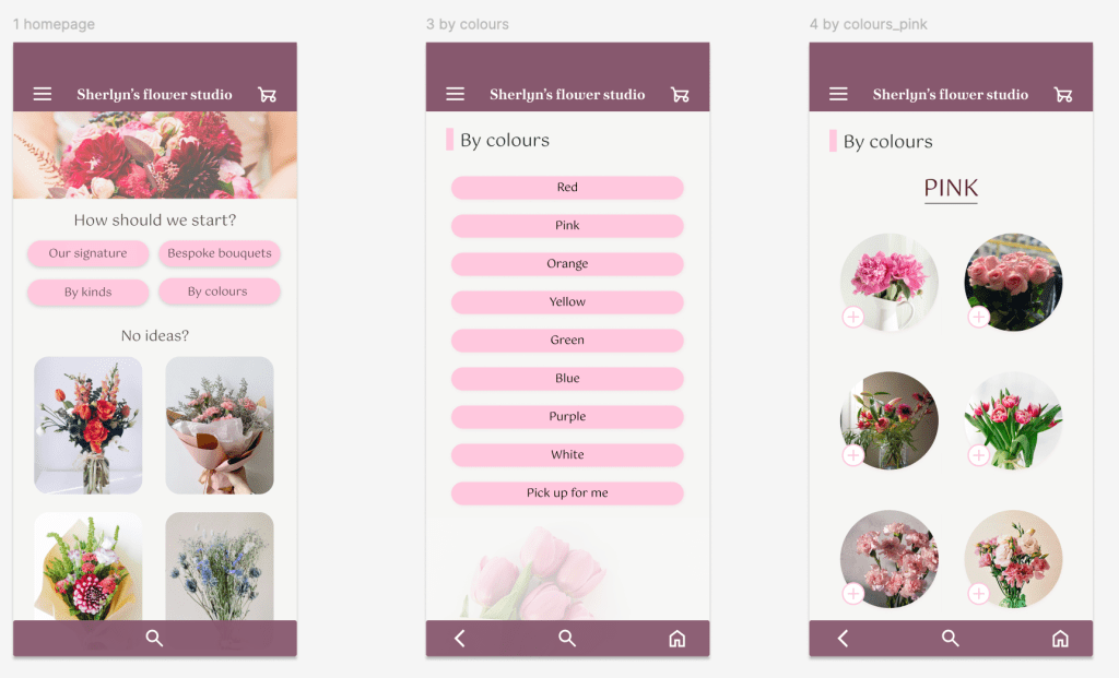
- The homepage feels overwhelming with too many buttons: ‘By Colours’, ‘By Types’, ‘Bespoke Bouquet’, and ‘Our Signature’.
- The section below adds even more visuals, making the page feel cluttered.
- The ‘By Colours’ page compounds this further, presenting yet another excessive list of options.
1.1. What Wasn’t Working
- The early design focused on offering various choices, but 1. it didn’t create any real value. It looked like a typical flower-ordering app and 2. didn’t address any specific problem.

2. Turning Point
By observing social media (both florists and customers) and talking to my floral class teacher (who also runs a flower shop), I realised that more features do not necessarily solve users’ problems.
Interviews revealed the real pain points:
- Users don’t know the current price of flowers
- They don’t know which shop to start with, they can only rely on recommendations from friends
- They’re unsure how far in advance
They would like to know if they can pick up flowers today, and how long it takes to prepare a bouquet.
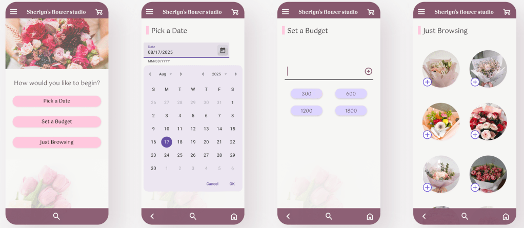
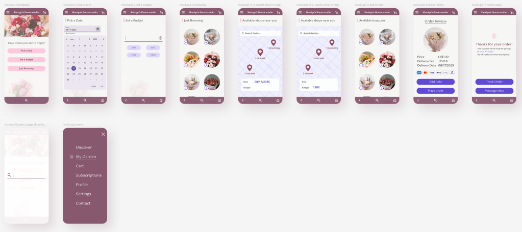
3. Second Version High-fidelity Prototype
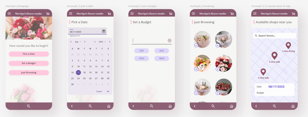
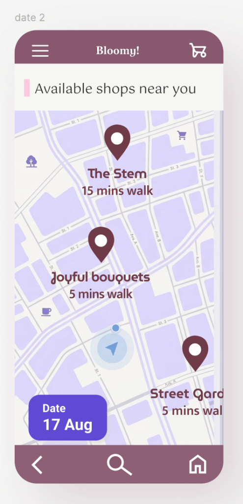
- Choose time, budget, and browse randomly. The design also displays available flower shops (start from 5km radius)
- Each feature addresses a specific problem:
Choose time solves the needs of customers with last-minute orders or those who suddenly want a bouquet
Choose budget: bridges the information gap between customers and florists
Browse randomly: helps potential customers who want to buy flowers but don’t know where to start
Usability Testing
Parameters
- Study type: Moderated usability study
- Location: Taiwan, in-person
- Participants: 3
- Lengths: 5 minutes
- Task: purchase a bouquet from start to order confirmation
Findings
| # | Finding | Severity |
| 1 | The budget/date fields appeared interactive, prompting users to attempt typing directly into them | High |
| 2 | Action icons were too small, making them difficult to tap accurately | High |
| 3 | The peek effect on bouquet images successfully encouraged users to scroll | working as intended |
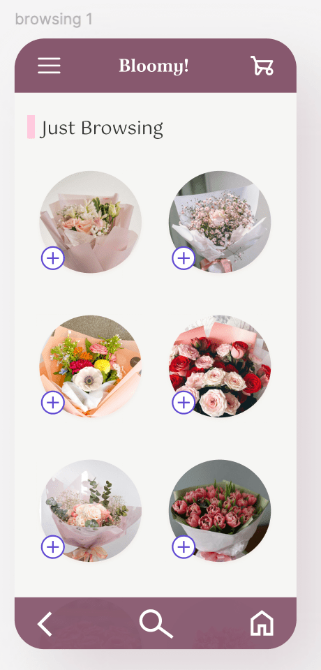
Note: 3. The peek effect on bouquet images was an intentional design decision: the partially visible cards were designed to signal scrollability, confirmed by user behaviour.
花束圖片的窺視效果是刻意為之。部分可見的卡片設計用來暗示可捲動,並已由使用者行為驗證。
Iteration
Input fields
Replaced with tag-style labels to clearly indicate non-editable information
Icons
Enlarged for easier tapping; before and after comparison shown above
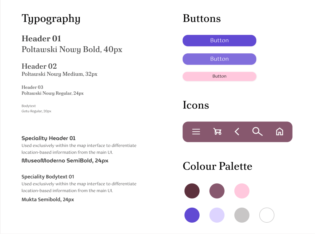
Style Guide
Going forward
Bloomy! is a mid- to high-fidelity prototype created for a UX course. Following a moderated usability test with three participants, several key insights and opportunities for improvement were identified.
Learnings & Reflections
- Not everyone wants a fully automated experience. Some users still value 1:1 conversations with florists, so the design should support both quick ordering and more personalised interaction.
- The app is not simply about finding “cheap” flowers — it is about setting realistic expectations and helping users understand what is achievable within their budget and timeframe. TWD 500 emerged as a comfortable starting price point across different budget ranges.
- Users who searched by date still expected to refine results by budget, and vice versa. This suggests the two filters should work together rather than as separate entry points, and future iterations should allow both criteria to be combined.
- I had not initially considered tag-style labels to display selected filters, assuming an empty field would be sufficient. In practice, users need a clear visual distinction between selected and unselected states — the tag style communicates this far more effectively.
- 並非所有使用者都希望流程全自動。部分訪談主仍重視與花店的一對一溝通,設計應同時支援快速下單與個人化互動兩種路徑。
- 這款 app 的核心不僅僅是「找到便宜的花束」,更包含幫助店家與使用者建立合理期待,釐清在預算與時間限制內能達成什麼。此外,在訪談中發現 TWD 500 在不同預算區間中都是普遍可接受的價位區間。
- 依日期搜尋的使用者仍期望能進一步以預算篩選,反之亦然。這說明兩個篩選條件應同步運作,而非各自獨立的空白,後續版本應支援同時設定兩項條件。
- 最初未考慮以標籤樣式顯示已選篩選條件,誤以為空白欄位就足以提示(使用者選擇哪個路徑)。實際上使用者需要的是選取與未選取狀態之間清晰的視覺區別,而標籤樣式的溝通效果明顯更好。
Thanks for reading.
Hope you enjoyed the journey.
